
Dashboard design fails quietly. Nobody files a ticket saying the report is useless. The page just stops being opened, the weekly meeting goes back to a spreadsheet somebody exported by hand, and six months later a new tool gets bought to solve a problem the old tool never had.
The tooling is rarely the reason. A company can run Power BI, Qlik, Tableau, Grafana and Metabase side by side and hit the same failure in all five, because the failure sits above the tool: nobody decided what question the dashboard answers, which number is authoritative, and who acts on it. Gartner's 2024 Chief Data and Analytics Officer Agenda Survey ranks low data literacy and resistance to change among the top inhibitors of data and analytics success, ahead of tooling gaps.
This is the reference page for the dashboard and data visualization cluster on this blog. It covers the decisions that come before the first chart, the modeling layer that makes numbers agree, the visual choices that survive a five second glance, and the performance and access rules that keep a dashboard alive after launch.
What dashboard design actually decides
A dashboard is a compressed interface to a decision. Three layers stack under every one of them, and problems in the lower layers surface as complaints about the top one.
The display layer is what people argue about: chart types, colors, layout. The semantic layer underneath defines what "revenue", "active customer" or "on-time delivery" mean, at what grain, with which filters. Below both sits the data layer: freshness, completeness, and the pipelines that feed it. When a sales director says the dashboard is wrong, the cause is almost always the middle layer, and the fix almost always looks like a modeling change rather than a visual one.
The other decision that comes first is what kind of dashboard you are building. Three types behave differently and mixing them into one page is one of the most common causes of abandonment.
| Type | Primary question | Audience | Refresh cadence | Typical failure |
|---|---|---|---|---|
| Operational | What is happening right now, and do I need to act? | Analysts, engineers, floor supervisors | Seconds to minutes | Alert fatigue from panels nobody tuned |
| Analytical | Why did this number move? | Data teams, business analysts | Hourly to daily | Too many filters, no clear entry point |
| Strategic | Are we on track against the plan? | Executives, board | Weekly to monthly | Metrics with no owner and no definition |
An operational dashboard refreshing every fifteen seconds and a strategic scorecard reviewed once a month do not belong on the same page or under the same permissions. Deciding the type early settles most later arguments about density and refresh rate.
Start from the decision the page supports
The most useful question during a dashboard requirements meeting is uncomfortable: what will somebody do differently because of this screen? If the answer is vague, the dashboard will be vague. Grafana's own documentation puts it plainly in its dashboard best practices: define a goal for the dashboard, and if it does not have one, question whether you need it at all.
Work backwards from the action. A churn dashboard for a customer success lead exists so somebody picks up the phone before renewal. That single sentence fixes the grain (per account), the time window (days to renewal), the sort order (risk descending) and the drill path (account to contract to support tickets). Without it you get eight charts about churn in general, which is interesting and unusable.
Then write the questions down in order of importance and lay the page out in that order. A logical progression from general to specific, which Grafana's guidance also recommends, gives the reader a path instead of a wall. Most people scan the top-left region first and stop reading somewhere around the third panel, so the panel that answers the primary question belongs there, and the diagnostic detail belongs below the fold or behind a drillthrough.
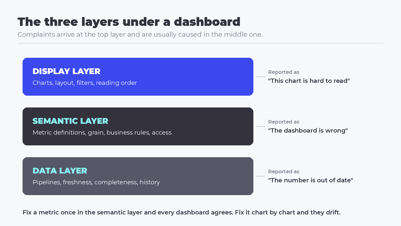 The three layers under every dashboard. Complaints arrive at the top and are usually caused in the middle.
One metric, one definition
Nothing destroys trust faster than two pages showing different revenue for the same month. Once that happens, every number on every page is treated as a suggestion and people go back to exporting raw tables. The fix is structural. Metric definitions belong in a shared layer that both the dashboard and any downstream consumer read from, rather than in per-report formulas that drift apart. That is what Power BI measures, Qlik master items, dbt metrics and standalone semantic layers all exist to do. The implementation differs, and the discipline does not: one definition, versioned, owned by a named person, reused everywhere.
- Wrong grain: a metric defined per order behaves differently from the same metric defined per order line, and the difference shows up only when somebody filters by product.
- Moving denominators: conversion rate breaks when a slicer filters the numerator and the denominator differently. This is the failure behind most "the percentages do not add up" complaints.
- Silent time zones: a daily metric computed in UTC and displayed to a team in another time zone will disagree with the operational system on roughly one day in every month boundary.
Fixing these is modeling work, done once, in the layer everyone reads. Fixing them chart by chart is how a team ends up with fourteen slightly different versions of gross margin.
Choosing charts people read fast
Once the metric is settled, chart choice is mostly a question of how the human eye processes a page. Research from the Nielsen Norman Group on preattentive processing is consistent on this point: position and length are read almost instantly, while area, angle and color are read slowly and inaccurately. That is the whole argument for bar charts, line charts and scatterplots as defaults, and against pie charts with nine slices.
| The question the reader has | Chart that answers it | Common failure |
|---|---|---|
| How do these categories compare? | Horizontal bar, sorted by value | Alphabetical sort, which hides the ranking |
| How has this moved over time? | Line chart, with the axis starting where the data starts | Truncated axis that exaggerates the trend |
| How are these two measures related? | Scatterplot | Adding a third and fourth encoding until nothing reads |
| What is the single current value against a target? | Big number with a target reference | A gauge, which spends half the page on decoration |
| Where is the distribution concentrated? | Histogram or box plot | Reporting only the average, which hides the tail |
Color deserves its own rule. Because color vision deficiency is common, hue works as a reinforcing cue rather than the primary way of showing groups, a point the Nielsen Norman Group research makes and that Qlik repeats in its best practices for designing visualizations, alongside a warning about legends truncating when labels run long. Position, shape and explicit labels carry the meaning; color makes it faster to find.
Two habits pay off immediately. Give every panel a description that says what it measures and how, so a new reader does not have to guess. Keep the same visualization in the same position across sheets, which Qlik's documentation also recommends, so people build muscle memory instead of re-reading the page every week.
Layout and performance: where dashboard design meets engineering
A slow dashboard is an unused dashboard, and page density is the main lever. Microsoft's optimization guide for Power BI recommends limiting the number of visuals on a report page to only what is necessary, and points to drillthrough pages and page tooltips as the way to offer detail without adding visuals. Every visual on a page issues its own queries, so a twenty-panel page is a twenty-query page every time somebody moves a slicer.
The same guide is direct about filters: a table left unfiltered against a very large model loads and uncompresses those rows on every refresh, and applying a Top N filter of, say, ten thousand items cuts memory use sharply without changing what the user sees. Tableau, Qlik and Grafana each have their own version of that advice, and the underlying rule is identical across all of them. Push work down into the model or the warehouse, return the smallest result the visual needs, and cache what does not change per user.
Row-level security interacts with caching in a way that surprises teams. Microsoft's guidance notes that with dynamic row-level security enabled, dashboard tiles cache per user and each security context generates its own set of refresh queries. A dashboard with five roles does five times the refresh work, which is fine when planned and expensive when discovered in production.
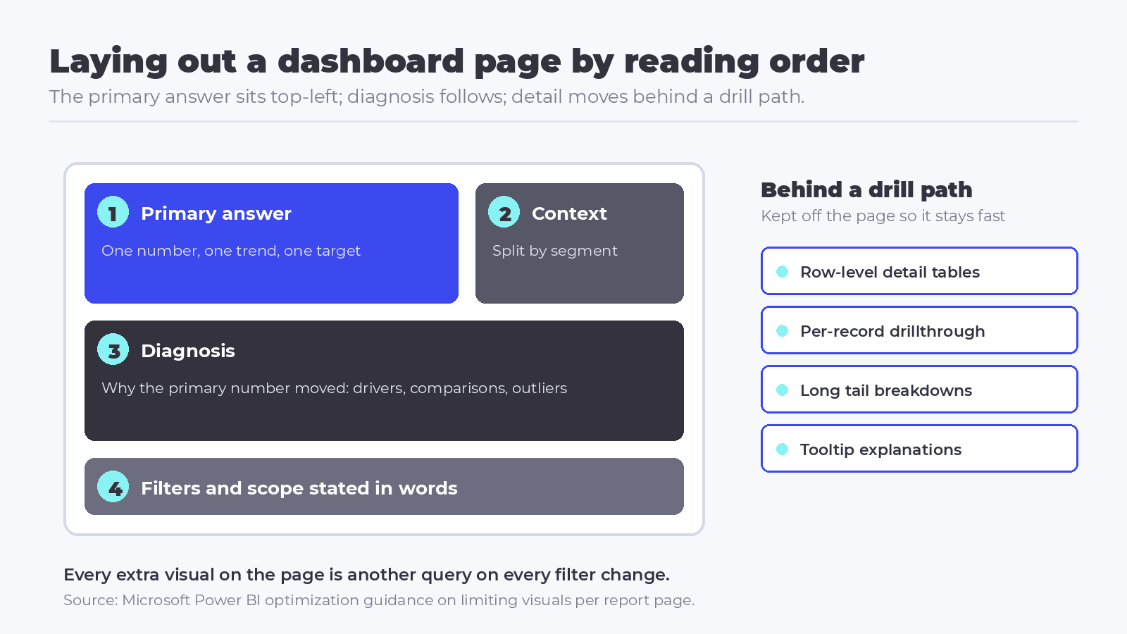 Layout follows the reading order: the primary question at top-left, diagnosis below, detail behind a drill path.
Access, governance and adoption
A dashboard that ships without an owner degrades. Filters break when a source column is renamed, a metric changes definition upstream, and nobody notices until a decision goes wrong. Treat published dashboards like production services: an owner, a documented purpose, a review date, and a retirement path for the ones nobody opens.
Governance also decides how far self-service can go. Letting business teams build their own pages is how adoption grows, and it works when certified metrics live in a shared layer and personal reports are clearly labeled as such. Where every team invents its own numbers, the trust collapse described earlier follows.
Adoption is where the Gartner survey becomes practical. The same research reports lack of ownership over data literacy initiatives as the most common barrier, cited by 69% of respondents, followed by poor results from training at 52% and inadequate tooling at 38%. Only 14% of organizations had created metrics to track progress at all. Applied to dashboards, that points to a cheap and rarely used tactic: instrument the BI platform itself, look at which dashboards are opened and by whom, and retire the ones with no audience.
For customer-facing analytics the bar moves again. Embedding dashboards into a product turns visualization into a security surface, where tenant isolation, token handling and per-user filtering outweigh chart choice.
Where to go deeper
- On why dashboards get ignored: the two most common patterns are a page built without a decision behind it and a page whose numbers nobody trusts. Both are covered in why dashboards often fail to drive real decisions and in the argument for moving from visual vanity to decision intelligence. If your organization has the opposite problem, too many dashboards rather than too few, the practical path is in our guide to data and analytics strategy, which starts from the decisions each report should support, and the step beyond reporting is described in from reporting to decision automation.
- On visual choices and narrative: the chart-level mistakes that quietly change what a reader concludes are in data visualization mistakes that undermine decision-making. For structuring a page as an argument rather than a grid, there is how to uplevel your data with the right visualizations and the eight principles in build dashboards that tell a story. A worked example on the factory floor, with diagnostic analytics as the goal, is in optimizing diagnostic analytics with custom dashboards.
- On the metric layer: shared definitions are the difference between two reports agreeing and two teams arguing. Start with how dbt Semantic Layer metrics work in practice, then read why AI agents get analytics wrong without a semantic layer, and pair both with rolling out self-service BI without losing governance.
- On tools, and when each fits: platform choice follows the audience and the deployment model. The reference pages are what Microsoft Power BI is and where it fits, Qlik Cloud and its open-source extensions and Tableau explained for dashboards and modern BI. For leaner teams, compare Metabase against Looker and read the case for open-source dashboards a data team will actually use. On the engineering side there are technical dashboards with Grafana and Prometheus, Grafana with multiple data sources, Grafana on top of BigQuery and visualizing AI pipelines with Apache Superset.
- On performance, embedding and security: when dashboards slow down as data and headcount grow, the tuning path is in keeping Tableau dashboards fast at scale, and the engine choice underneath analytics workloads is compared in PostgreSQL versus MongoDB for BI and data exploration. For customer-facing analytics, embedded analytics with React and Next.js covers the architecture and JWT done right covers the authentication layer. Where natural language is being added on top, using LLMs to turn dashboards into decision engines sets out what changes and what does not.
Good dashboard design is a sequence, and the visual part comes last. Decide what action the page exists to trigger, settle metric definitions in a layer everyone shares, choose encodings the eye reads quickly, keep the page light enough to load before attention runs out, and give the result an owner who retires it when it stops earning its place. Skipping that order is how a company replaces its BI platform every few years and rebuilds the same problem in a new interface.
Keeping that order across dozens of dashboards is easier when every chart, filter and empty state comes from a shared library, which is the role of Figma design systems for analytics products.
If your team is rebuilding a reporting layer, unifying metric definitions across tools, or embedding analytics into a product, our specialists can help you design the architecture that fits your context. Talk to our team and move your analytics from reporting to decisions.

Frequently asked questions about dashboard design
What is dashboard design?
Dashboard design is the practice of deciding what question a dashboard answers, which metric definitions it uses, and how those numbers are displayed so a reader can act quickly. It covers three layers: the underlying data, the semantic layer that defines each metric, and the visual layer of charts and layout.
Why do dashboards fail to get used?
Most abandoned dashboards were built without a decision attached to them, or contain numbers that disagree with another report. Both problems sit below the visual layer. Once a reader finds two conflicting figures for the same metric, trust collapses and the team returns to manual spreadsheet exports rather than filing a complaint.
How many charts should a dashboard have?
There is no fixed number, and the practical limit is set by performance and reading order. Microsoft's Power BI optimization guidance recommends limiting visuals on a page to only what is necessary, using drillthrough pages and tooltips for detail. In practice, a page that answers one primary question with three to seven panels reads faster than a dense grid.
What is the difference between operational, analytical and strategic dashboards?
Operational dashboards answer what is happening now and refresh in seconds or minutes for analysts and supervisors. Analytical dashboards explain why a number moved, refreshing hourly or daily for data teams. Strategic dashboards track progress against a plan, refreshing weekly or monthly for executives. Mixing the three on one page is a frequent cause of abandonment.
Which chart type should I use for each question?
Comparisons between categories read best as sorted bar charts, movement over time as line charts, and relationships between two measures as scatterplots. Position and length are processed almost instantly by the human eye, while area, angle and color are read slowly, which is why Nielsen Norman Group research recommends bars, lines and scatterplots as defaults.